Travel UX
Redesigning cancellation support to reduce friction
A usability-test-informed redesign of eDreams’ cancellation support flow to improve findability of policies and contact options—without forcing users to log in.
Overview
This project redesigns a cancellation-support experience to reduce cognitive load, remove dead ends, and make support options clear at the exact moment users need them.
What I found
The goal was to identify friction in the cancellation-support journey and redesign the flow so users can quickly find policy information, cancel online, or contact support without confusion.
Problem
- Key information was difficult to locate in a time-sensitive scenario.
- Support options weren’t clearly prioritized.
- Too many paths led to similar pages, increasing cognitive load.
Task flow
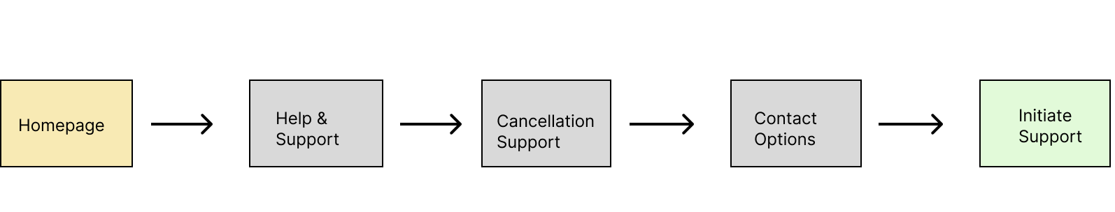
Homepage → Help & Support → Cancellation Support → Contact Options → Initiate Support
Wireframes
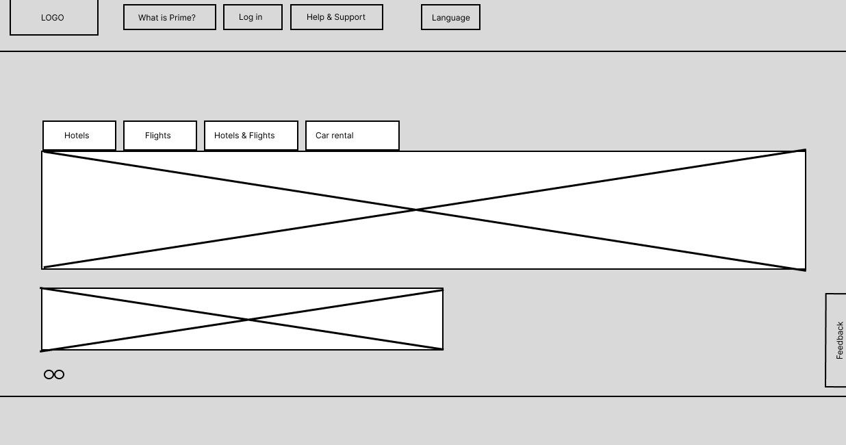
Homepage wireframe.
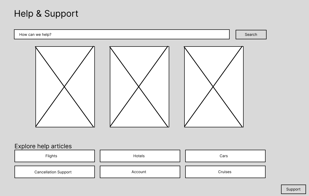
Help & Support wireframe.
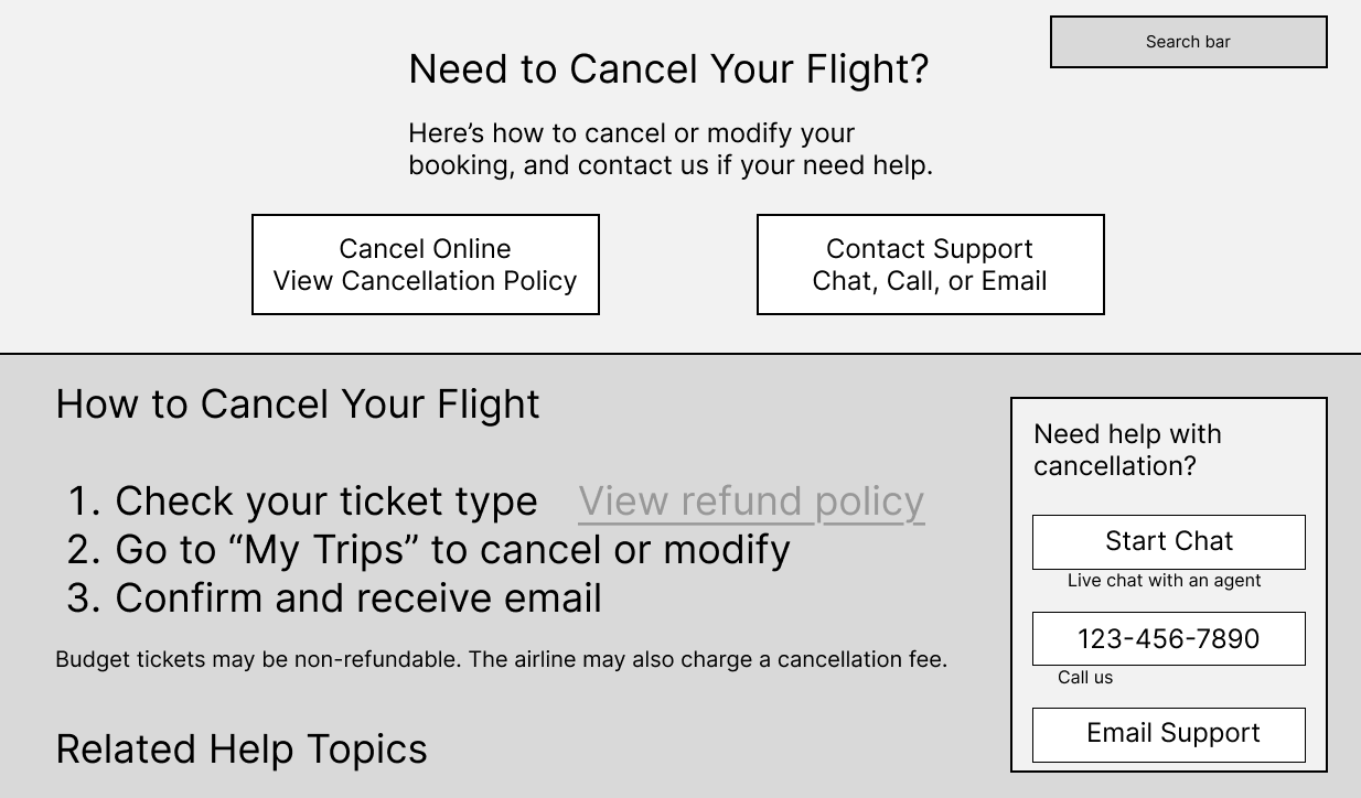
Cancellation Support wireframe.
Final UI concept
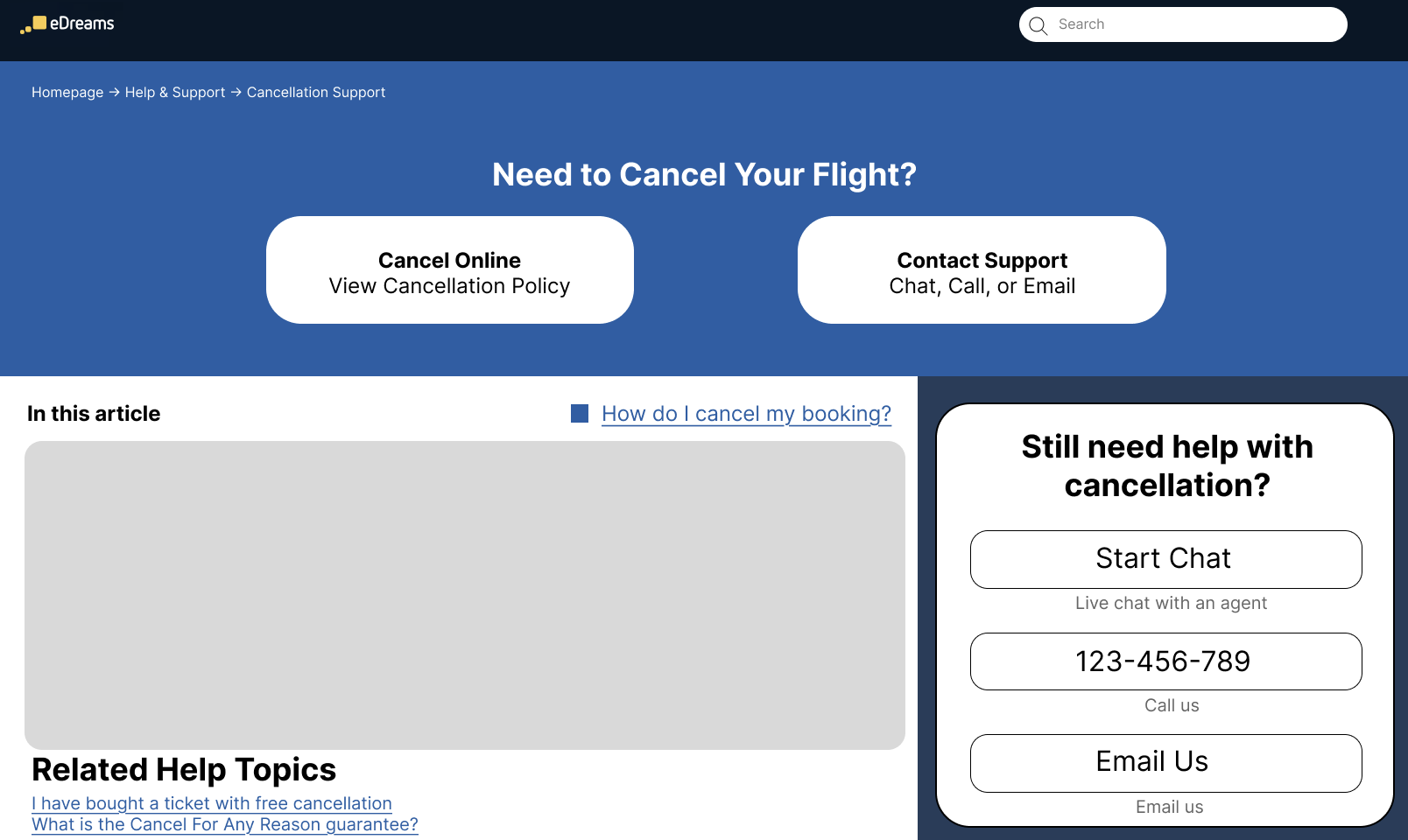
Primary actions (Cancel Online / Contact Support), step-by-step guidance, and a persistent support panel.